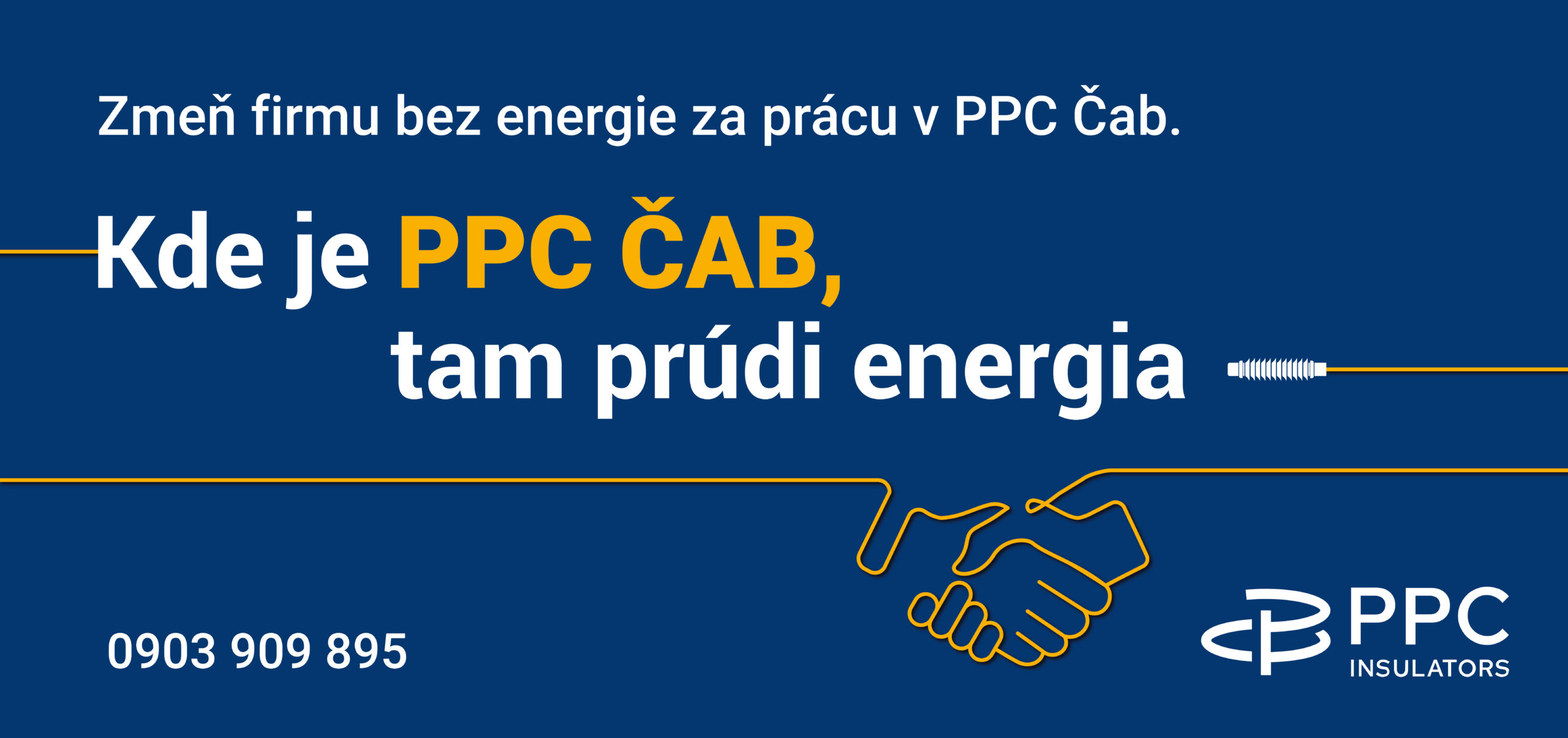
The concept “There the energy flows”
We started from the inverse interpretation of the product itself: Insulators are not meant to separate, but to allow energy to flow where it should.
Claim:
“Where PPC Čab is, there the energy flows”
This slogan became the core of the entire communication and at the same time an open template with which we can work dynamically.
Flexibility of the concept:
Values and corporate culture:
- Where there is cooperation, there is energy flowing
- Where there is innovation, there is energy flowing
- Where there is tradition, there is energy flowing
Employee benefits:
- Where there is a 13th salary, there is energy flowing
- Where there are quarterly bonuses, there is energy flowing
- Where there is flexible working hours, there is energy flowing
Recruitment:
- Change a company without energy to one where energy flows
- Where there is a stable employer, there is energy flowing
Local connection:
To intensify trust and interest, we created hyperlocal visuals and headlines for the municipalities around PPC Čab.
“Where there are 16 Čakajovčanov, there is energy flowing.”
Join those who already work at PPC Čab.
Visual identity:
The key element has become the “energy line” – a yellow line that runs through the visual, creates:
- a connection between the text and the slogan,
- passes through the graphic symbol of the insulator,
- and ends as a simple iconic illustration (e.g. a light bulb, a heart, a house…).
This element can be easily adapted to billboards, citylights, online banners and internal communication.
Conclusion:
There is never too much energy. It needs to be directed.
PPC Čab – that’s where the energy flows.