We turn visions into reality and create an unmistakable brand for the client. It was the same with Rinee. Our goal was to build on a valuable piece of jewellery with a valuable emotion so that one supports the other.
The creation of Rinee jewellery was inspired by the birth of Katarina Vavrova’s daughter, the author of the designs. The initial impulse was therefore an emotion. This is the basis of our concept.
Our intention was to build a solid branding strategy for the client in order to reach out and differentiate themselves.
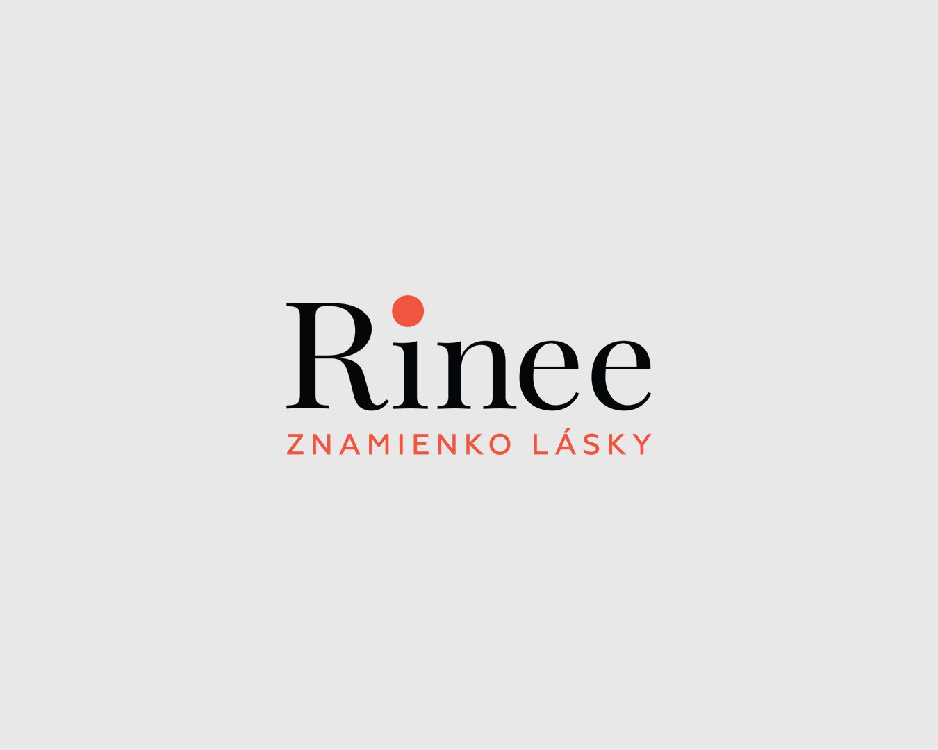
One of the significant elements that we saw as distinctive and iconic was the “love sign”, the red dot in the logo, which is a metaphor for the perfect piece of jewellery. For Rinee, we created a subtle design that represents a key visual that supports the glamour of the jewellery, as well as a way of communicating that is poetic and tender. We dressed the brand’s website in a stylish, yet still subtle and clean design that draws attention to the product through its simplicity.
Another way of presenting the brand was the placement of an exclusive discount voucher for a babybox, which is given to mothers in hospitals after the birth of their child.